12 Article Verhalen Healthcare Design V2 Seamless Map

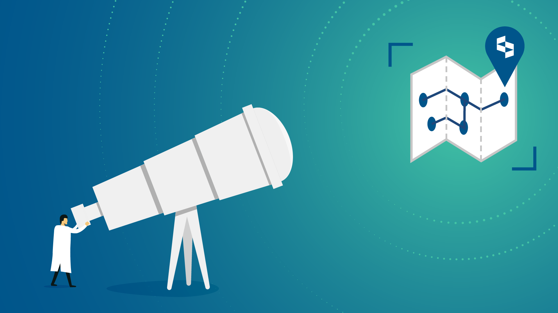
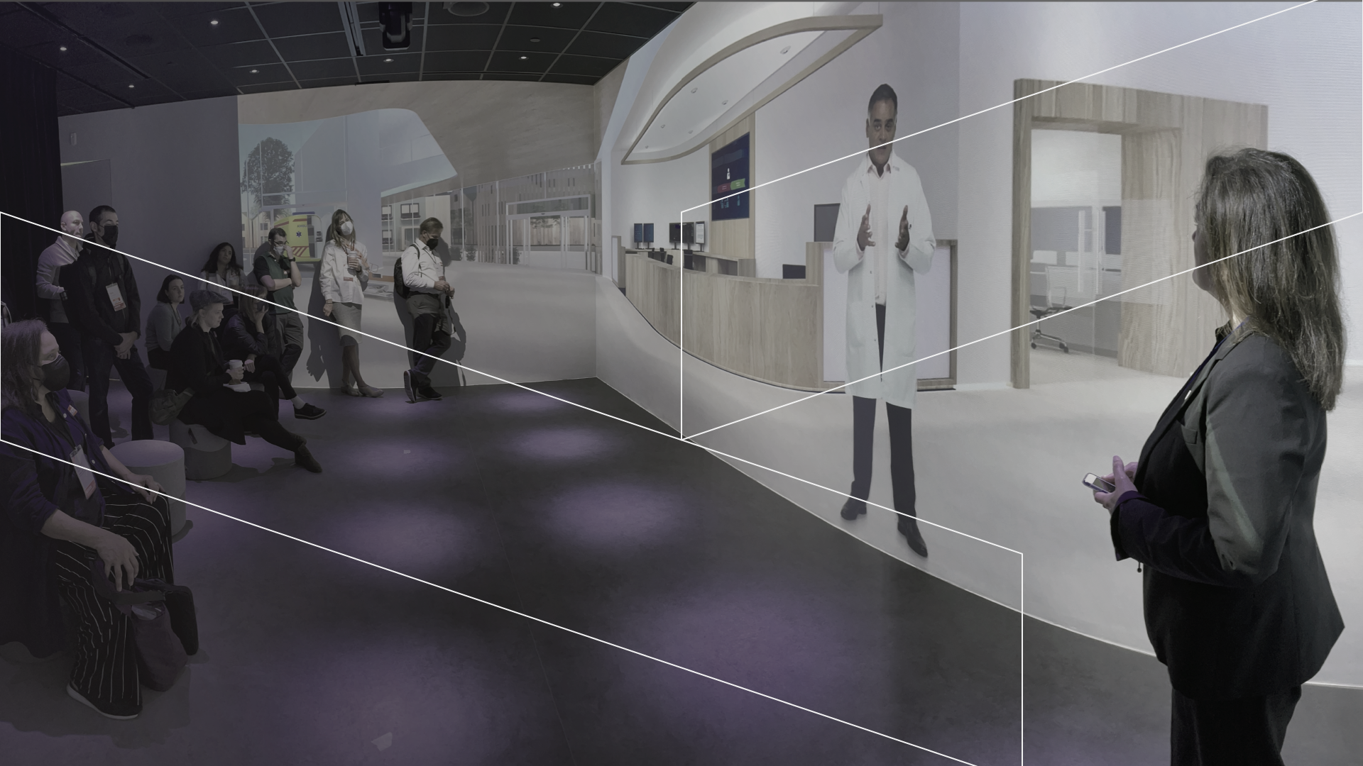
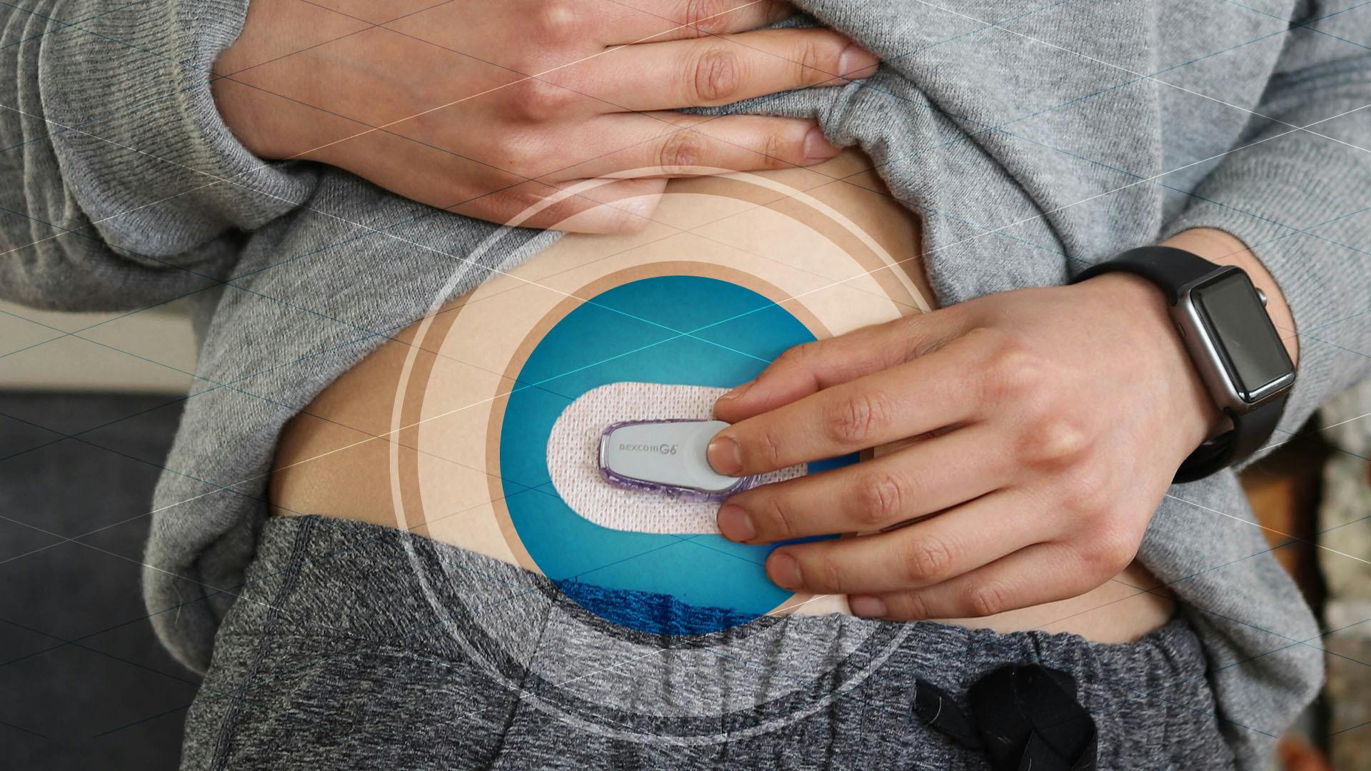
Designing for healthcare part 2: Mapping the way to seamless integration

You can probably point to a medical device or healthcare service that left you feeling dissatisfied or, even worse, disrespected.

You can probably point to a medical device or healthcare service that left you feeling dissatisfied or, even worse, disrespected.

Delve has put together a 4-part series on designing the opposite—how to effectively deliver and profitably commercialize human-centered healthcare solutions.

Part 1 (this piece) is about selecting a long-term vision.
Part 2 is about mapping your way to seamless integration.
Part 3 is about the complexity of simplicity.
Part 4 is about empathy.

Here's part 2.

Key Lenses that Need to be Mapped

Delivering human-centered solutions in healthcare means thinking about the total user experience from start to finish. It’s rare when something is successfully designed in a vacuum, especially in healthcare and medical devices. Each design decision lies within a deeply interdependent, complicated system. As with most things in healthcare, the process of creating a seamless experience is complicated, too.

It starts with due diligence in mapping user experiences and the systems in place to deliver those services. By creating detailed maps of the systems/services/experiences, the project team has full understanding when they choose to focus on one area over another. Maps also provide visibility into the contextual and systemic implications of focusing on specific areas. Maps guide the team in understanding how to address gaps and pain points in the system, and it gives a clear understanding of how new solutions must integrate in order to thrive instead of being attacked by the white blood cells of the system. An initial experience map is not a solution, but a model to establish a shared understanding of the current state and a catalyst to design and innovation efforts.

Detailed experience maps for a healthcare service or a medical device are often so complex that they fill part of or the entire length of a wall. The experience may even require several maps or be accompanied by a macro-overview map. Each detail can be contextual and actionable for a designer.

However, maps serve another purpose. The experience map can serve as a constant at-a-glance reminder for the many people, teams and stakeholders involved in contributing to the creation or improvement of a solution. Company stakeholders, executives and business units often post an experience map up on their wall as a constant reminder to see the forest from the trees when they get pulled into the weeds. It keeps them focused on the system, the pains, the gaps and the interdependencies.

There are two key lenses of an experience that need to be mapped:

  1. The user- and customer-facing (front stage) experiences. This view is most helpful for informing and inspiring design teams to create human-centered solutions.
  2. The systems that must be in place to make sure the product or service can be delivered. The customer doesn’t see many of these critical backstage steps. These elements (people, props, places, partnerships, processes) are key components to a service blueprint that ultimately creates a guide to implementation. This information is most helpful to informing service design and ensuring seamless implementation that can deliver on the front stage experiences.

User experience maps

First, let’s talk about the user experience map. It visually illustrates the steps in the processes, the journey of the various users, and interconnectedness of the overall experience in a model that is easy to understand. The key elements on the map should include:

Users: This includes a breakdown of key user types from end users and influencers to decision makers. The map often calls out their emotional journey.

Tasks: This is a consideration of all of the tasks along the process including how users acquire, use, store, re-use and dispose of products and tools or the actions to utilize a service. Over time, this may include daily, weekly, monthly, annual or seasonal variations.

Tools: This is all of the hardware, software, commodity and communication tools used along the process. This includes details down to forms, patient IDs and RFID information.

Environments: These are all of the special environments including offsite and remote locations of users as well as virtual environments.

Additionally, all of these elements should:

  • Show progress over time
  • Scale or proportion the stages of the experience relative to each another
  • Signal the interconnectedness of the various elements.

For healthcare and medical devices, a simple list of key map elements becomes a complex system very quickly. Users can be broken up into three key types: end users, influencers and decision makers. For example, the end user for a blood diagnostic instrument is not only the patient who receives the result of the blood test, but also the laboratory technician operating the instrument and the person servicing and

12 Article Ami Service Design Operating Room Map H1
Example of a user experience map for an operating room.
12 Article Ami Service Design Map H1
Example of a service design map or blueprint.

maintaining it. However, the person responsible for selling those instruments is certainly an influencer. Finally, the lab manager, hospital CEO and even group purchasing organizations hold the key to decision making.

Broadly speaking, the users of healthcare products and services might include patients, caregivers (family and friends), clinical staff (nurses, doctors, specialists, administration), and payers (medical insurers, pharmacy benefit managers). Other entity executives, group purchasing organizations, FDA and health advocates are influencers and decision makers in the end – and therefore users that need to be designed for or at least considered. Identifying all of this information may require both quantitative data to inform proportion and importance as well as qualitative data representing the importance and meaning of the users’ point of view.

Most importantly, you need the insights to highlight the pain points, gaps and interdependencies that make the information an actionable catalyst for the design team. Identify all of these opportunities and set priorities that match your organization, your strengths and your North Star.

Let’s put the experience map into a concrete example. A medical device company believed their customers wanted their diagnostic instrument to be faster and had their R&D teams focused on creating speedier systems and technologies. After they had a complete experience map in hand, they learned that labs do indeed want faster results but their instrument wasn’t the issue. The gap was in accessing the samples — collecting, labeling, inputting the data and sample, and transferring it to the lab. This was a very different challenge to address and this insight was a catalyst for the team. The map continually reinforced this big picture to keep everyone focused on meaningful priorities rather than assumptions.

Service design maps

The other model is a service design map, which also visualizes what it takes to deliver the product or service to its users. A framework used in service design is the Five Ps (people, places, props, processes, partnerships), highlighting elements of the experience that are unique to services (rather than products only). Service design maps include actions that are invisible to the user. In some cases, these backstage processes are well established or may require little change (i.e., a simple product like a new sample tube or vial). In other cases, the back stage process is almost the entirety of the service — think health insurance.

Mapping the backstage actions includes things such as service employees, tools, apps, data, networks and support processes/partners. For this kind of map, it is particularly important to establish the current state in order to identify what can be modified and what needs to be added or completely re-vamped. A service map serves as a powerful tool to identify areas to add or improve the user experience. Once the service map is modified to deliver on those user experiences, it evolves to a detailed service blueprint that can be used to guide implementation efforts.

In today’s economy, service design is becoming increasingly important to consumer experiences and realizing business opportunities. Services account for 82 percent of the US GDP and that number is expected to grow as companies increasingly position themselves on a product-service continuum. And 1.7B people work in services, the larger part of the active working population. While most businesses are well aware of the need to design new and better products, it is a great time to design better services as the practice is growing, the market is large and the user need is ripe.

Before you start your journey, create your map

Creating maps as tools for designing better healthcare products and services not only provides a critical catalyst, but maps are the best way to make sure your new or improved solutions intentionally consider the context and interdependencies of very complex healthcare systems and processes.

Consider which type of map(s) you need and don’t take shortcuts. By designing this way, your users’ experiences will be integrated into the broader healthcare ecosystem, highlighting the improvements you are delivering and ensuring that the broader system does not detract from the value you intend to deliver. A well-integrated solution will feel straightforward and easy to the user, which is a big win. And if you do a really great job it just might delight them too, which is above and beyond in healthcare.

Designing in a vacuum can lead to solutions that are so isolated that they cause other issues or reflect embarrassing oversights. Human-centered design and mapping can help your team set priorities so you deliver thoughtful, integrated solutions that show you understand the users’ whole experience within the mammoth healthcare ecosystem.

Continue Reading

Delve has put together a 4-part series on designing the opposite—how to effectively deliver and profitably commercialize human-centered healthcare solutions.

Part 1: Finding your vision.
Part 2: Mapping your way to seamless integration.
Part 3: The complexity of simplicity.
Part 4: Empathy.

DMI learning HERO2
Three Principles for More Human, Solution-Focused, Fair, and Inclusive Design
Designers have a responsibility to design a world that all want to live in. Here are three principles that can help us navigate the complexities of design decision-making and truly achieve design success.
Practice empathy 2 header 1
Empathic Design in Practice
What comes before and after you walk in your users' shoes? We distill empathic design into six principles for easy adoption.
2022 06 23 Waterfall Comparison Graphic falling web
2021's Top 10 Innovation and Product Design Posts
In 2021 you devoured blogs about looking at old problems in new ways, unlocking your professional potential, and creating products that change the world for the better.
The future of medtech wearables
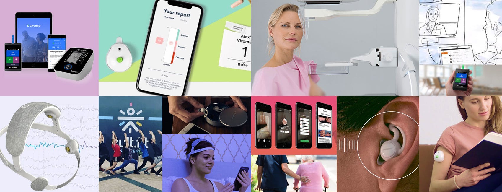
Four Ways to Win the Future of MedTech Wearables
Soaring demand for wearables has created a market saturated with the things—prompting an 18.1 percent year-over-year growth worldwide, according to Gartner.
HEADER Rere BLOG template 01
Our Favorite Remote Research Methods for Product Design
When in-person research needs to shift, try these remote research methods. All have yielded great insights for us at various stages of product design.
01 Hero
Five Megatrends Driving the Future of Medical Devices
Our free, on-demand webinar explains why innovation is so critical in healthcare, and introduces our Framework for Strategic Innovation: Health + Wellness.